 Pro CSS3 Animation, Apress, 2013
 Massive Head Canon
 The New Defaults
 CSSslidy
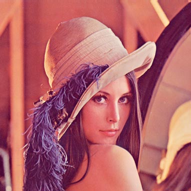
Filters allow us to visually process an image in the browser without needing to go through PhotoShop or use cycle-intensive, script-heavy methods in JavaScript or PHP. CSS3 filters are broadly supported in the most recent versions of Firefox, Safari and Chrome, and we can gain support in older versions and alternative browsers – even IE – by using a combination of techniques.
In this article we’ll convert an image to black & white with pure CSS using the classic test image of Lena Söderberg. In future articles I’ll discuss how to achieve sepia toning, blurring, brightness, contrast and other visual effects with CSS.
The CSS3 greyscale filter
Desaturating a color image couldn’t be simpler with CSS3. We’ll apply the filter as a class, as you’d typically desire several images to be affected by the code at the same time:
Naturally, all current browsers implement CSS3 filters via vendor prefixes, so our first job is to insert that code, writing in CSS that does not yet exist in order to future-proof our work:
Applying the class to the image is easy:
Add An SVG Filter Effect
The CSS shown to this point works only in Chrome 18+, with support in other browsers expected to arrive soon. To gain the same effect in Firefox 4+, we need to use an SVG filter, which I’ll create as a separate document named desaturate.svg. The code for that file will be:
If the SVG code looks slightly daunting – and the matrix math behind it is somewhat complex – don’t worry. This is one piece of code that I’d actually encourage you to copy and paste as a generic “recipe”. I’ll explain matrix transformations in a future article.
With the SVG file saved beside our HTML page and test image, we will extend the CSS to become:
Add Support for IE
So far our code covers future browsers, recent versions of Chrome and Firefox 4+. To include IE 6 – 9, we'll apply Microsoft’s simple but proprietary use of filter:
If you want to add in support for older versions of Webkit:
Unfortunately Safari and Opera are still left out of the picture, but Safari 5.2 – due to be released very soon – should support the –webkit CSS3 filter prefix, and Opera’s support for CSS3 is continuing to improve.
The CSS we've written here allows us to visually convert an image to black and white on the fly in our browser, with no need to save new versions in PhotoShop. Using CSS also makes the image much easier to modify: for example, you’ll see that lowering the percentage used in our declaration from 100% to 50% causes a visual blend of the desaturation effect with the original color image.