 Pro CSS3 Animation, Apress, 2013
 Massive Head Canon
 The New Defaults
 CSSslidy
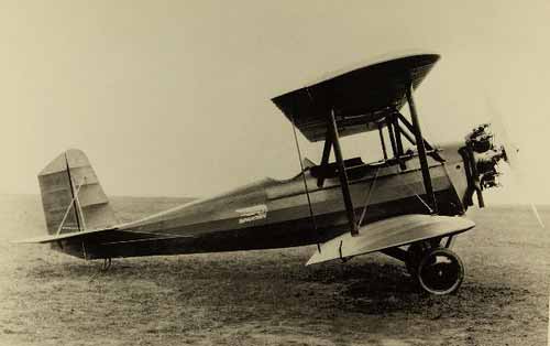
Mouseover the image above to see an example of CSS3 animation. Photograph of Spartan C3 biplane provided by San Diego Air & Space Museum archive, licensed under Creative Commons.
CSS be used for more than the mere transformation of elements; it can also be used to animate them. You should be aware that CSS transitions are very much in draft. Safari / Chrome / Mobile Safari have the best support for CSS3 animation; the ability is also in Firefox 4+, Opera 10+, and IE9+.
This new ability in CSS definitely rubs up against JavaScript, which has traditionally been used for animation on web pages. However, animation still falls under the purview of CSS: remember, CSS is about the appearance of elements. That includes animation. The domain of JavaScript is behaviour, which is now defined at a deeper and (in some ways) more basic level. If you want to highlight alternating rows of a table, that’s CSS (the way something looks). If you want the data in the table to be sortable based on different criteria, that is JavaScript (the way something acts on a page).
The principles of CSS animation are very simple:
You can transition most every CSS property you can imagine, and some you likely cannot. Animating properties like opacity, to create fade in and fade out effects, or CSS3 transforms, like rotate, translate and scale, are obvious… but you can also animate color, background, shadow, width, height, z-index, columns, line-height and font-size, to name just a few.
Let’s say we have an image with an id of biplane on the page. We want to bring the page to life by having this image rotate slightly when the user places their mouse over it. If we were to do this without animation, but still in CSS3, the code would be very simple:
This works fine, except for the fact there is no transition between one state and the other: the image “jerks” when it rotates, as it moves in a single step. Let’s smooth this transition with more CSS3. At the very basic level, we need to specify only one property: how long it takes for the element to animate between its original state and the new orientation, a draft property called transition-duration:
That’s it. Up-to-date browsers will transition the rotation of the image over 1 second; older browsers, such as Firefox 3.6, will still rotate the image, just without any transition between the two states.
Those closely observing the movement of the image will have noticed that the animation is automatically eased in and out: the rotation starts off slow, speeds up to reach a terminal velocity, and then slows down before it comes to rest (increasing the amount of rotation and/or the time taken to do so may enhance your perception of this).
Animation in CSS has easing: built-in organic, natural motion. If you want a more “mechanical” feel to the motion, you can achieve it by changing a property known as the transition timing function to linear:
It’s possible to set the timing function to other values, or even to mathematically plot out Bezier function easing curves:
Finally: if you’ve used the code above, you’ll see that the transition works on mouseover, but not when you move the mouse off the element: when that occurs, the image jerks back to its original position. To solve this problem, we do something that may appear counter-intuitive at first: we move the transition information out of the :hover state declaration and into the default state. At the same time, we should recognize that this code is getting a little long, even for CSS3: transition properties, like everything else, can be shortcut. Let’s move the code and re-write it at the same time:
Perhaps the easiest way to think of this is that we previously indicated that the transition only occurred on the way to the hover state; with this change, we are indicating that the transition affects all effects, over a 1 second period, using ease-in and ease-out, both to and from the default state.